10 Best Web Design Companies for Small Businesses
Key Takeaways:Gauss delivers enterprise-quality websites ...

Author:
Tomislav Horvat
Micro-Interactions and Kinetic and Scroll-Triggered Animations enhance user engagement by providing interactive and dynamic feedback, making navigation more intuitive and enjoyable.
Interactive 3D Models and Cinematic Scrolling create immersive and engaging user experiences, especially in e-commerce, by allowing users to interact with products and content in a dynamic, narrative-driven manner.
Accessibility and User-Centric Design are crucial in ensuring that websites are usable for everyone, emphasizing strong color contrasts, responsive design, and clear labels.
Sustainable Web Design focuses on minimizing a website's carbon footprint through lightweight design and green hosting services, aligning with broader sustainability goals.
Ultra-Minimalism and Text-Only Bold Typography emphasize simplicity and readability, using high contrast and clean lines to create visually impactful designs that focus on core content.
Y2K and Sci-Fi Inspired Aesthetics and Scrapbook and Collage-Style Graphics offer unique design inspiration by blending retro-futuristic elements with modern web technologies, creating distinctive visual experiences.
Gamified Design Elements increase user interaction and loyalty through game-like features, making website exploration more enjoyable and engaging.
Honorable Mentions include top web design trends like Dark Mode, Parallax Scrolling, Responsive Web Design, and Gradient Color Schemes, which continue to influence the latest web design trends and graphic design practices.
Micro-interactions play a vital role in enhancing the overall UX by providing subtle, yet meaningful, feedback to users.
These tiny animations or responses to user actions are designed to make your website more engaging and interactive.
For example, you might notice color changes when hovering over links or buttons, which signal that the element is clickable.
These small, organic animations guide users through interactions on your site, making navigation more intuitive and enjoyable.
In e-commerce, micro-interactions are particularly useful for showcasing product features in a dynamic way.
Whether it’s a slight movement when a user hovers over a product image or a subtle animation that highlights a special feature, these elements can significantly enrich the shopping experience.
Additionally, incorporating more elevated micro-interactions, like gradient shifts or color pops, can make your site visually appealing, keeping users both visually and emotionally engaged.
This approach not only draws users in but also helps reduce bounce rates by making the overall experience on your website more compelling.
Kinetic typography, which involves moving text, is a powerful tool to grab attention and highlight important content on your website.
By introducing movement, you can make your messages stand out, ensuring that they capture your users' focus.
Scroll-triggered animations are another way to engage users, activating elements as they scroll through your page.
This interaction can include color changes, fading effects, or even triggering movements that bring a page to life.
These animations are particularly effective for storytelling, allowing you to create an interactive narrative that unfolds as users scroll.
Cinematic scrolling, which combines storytelling with visual effects like 3D rotations and slow zooms, can transform static pages into dynamic, immersive experiences.
This technique enhances the user experience by making your website not just a platform, but an engaging journey that keeps users invested in what comes next.
Integrating 3D models into your website is a great way to boost user engagement, especially in e-commerce. These models offer a more realistic view of products, allowing customers to interact with them from various angles.
This level of interactivity adds depth to the shopping experience, making it more immersive and enjoyable.
When users can engage with 3D content, their confidence in the product tends to increase, which can lead to higher conversion rates.
However, implementing these features requires advanced web technologies, which can elevate your website's overall interactivity. This approach is particularly effective for showcasing complex products or for brands looking to project an innovative image.
By allowing users to explore products in a detailed and interactive manner, you can create a more engaging and memorable online shopping experience.
Cinematic scrolling is a technique that blends storytelling with scroll-triggered visual effects, such as slow zooms and 3D rotations.
This method is designed to create immersive experiences on websites, making the content feel like a movie rather than just static text and images.
By integrating these effects, you can guide users through a dynamic and narrative-driven journey that keeps them engaged from start to finish.
This approach is particularly popular for showcasing hi-tech or innovative products, often using full-screen imagery to make a strong visual impact.
The combination of cinematic scrolling with striking visuals enhances user engagement, making the experience on your site more compelling.
While implementing these features requires a higher budget and technical expertise, the dramatic effect it adds to your web presentations can be well worth the investment.
You’ll often see this technique employed in product showcases, landing pages, and promotional sites where making a memorable impression is key.
Accessibility and user-centric design are crucial for creating websites that everyone can use, regardless of their abilities. Prioritizing strong color contrasts is a simple but effective way to improve readability and make your site more accessible.
This ensures that all users, including those with visual impairments, can easily read and navigate your content.
Implementing focus indicators for keyboard navigation is another important step, as it helps users who rely on keyboards to move through your site efficiently.
Clear labels and instructions on form fields, instead of relying solely on placeholder text, also enhance usability by making forms easier to understand and complete.
Functional alt tags for images are not just good practice for accessibility but also benefit your site's SEO.
Additionally, incorporating features like voice search, video transcriptions, and image captions is becoming standard as they help reach broader audiences and comply with web standards.
Ensuring responsive design is also essential, as it guarantees your site works seamlessly across all devices, enhancing the overall user experience.
Sustainable web design focuses on minimizing a website's carbon footprint by optimizing load times and reducing resource usage.
By emphasizing lightweight design, with fewer and more efficient elements, you can decrease energy consumption, making your site more eco-friendly.
One effective strategy is to use green hosting services powered by renewable energy, which supports your sustainability efforts.
Implementing lazy loading techniques can further reduce unnecessary data load on the server, ensuring that only essential content is loaded when needed.
Encouraging a minimalistic design approach not only aligns with current design trends but also helps reduce data transfer, leading to lower energy usage.
It’s also important to consider the environmental impact of digital assets like images and videos. Opting for compressed formats can significantly reduce the size of these files, contributing to a more sustainable web presence.
Finally, aligning your web design strategies with your overall corporate sustainability goals is a powerful way to build a responsible brand image.
By integrating these practices, you can create a website that not only performs well but also reflects a commitment to environmental stewardship.
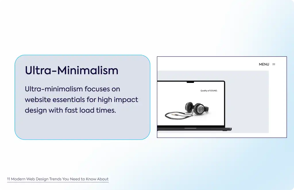
Ultra-minimalism is all about stripping down your website to the bare essentials, removing any unnecessary clutter, and putting the focus squarely on core content.
This design trend often leans on monochromatic color schemes or very limited color palettes to maintain simplicity and functionality. By doing so, you can also improve website load times, which is a key factor in user retention.
Incorporating high contrast and clean lines, ultra-minimalism creates a visually impactful design that’s both modern and efficient.
To add depth without overwhelming the user, subtle animations or kinetic elements are often paired with this style.
These small touches enhance the user experience by minimizing distractions and keeping the focus on what really matters.
Bold typography is becoming a popular choice as a primary visual element in web design, often taking the place of images.
This approach simplifies messaging by focusing on impactful text that quickly conveys your message.
High contrast between text and background ensures readability, making it easier for users to absorb information at a glance.
This style is especially effective in hero sections, where a strong first impression is crucial. Bold typography helps deliver a clear, concise message that grabs attention right away.
Often seen in minimalist designs, this approach keeps the interface clean and modern, allowing your message to stand out without unnecessary distractions.
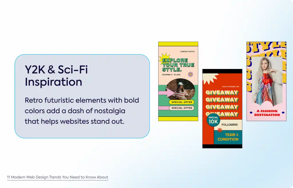
Y2K aesthetics and sci-fi-inspired designs are making a comeback, incorporating retro-futuristic elements that harken back to the early 2000s.
These designs often feature metallic textures, bright colors, and digital glitch effects that evoke a sense of nostalgia while still feeling fresh and modern.
Sci-fi aesthetics frequently include neon colors, cyberpunk themes, and futuristic fonts, making them a popular choice for tech brands looking to evoke nostalgia or create futuristic vibes.
By merging these nostalgic elements with modern web technologies, you can craft a unique user experience that stands out.
Y2K-inspired designs might also include pixelated graphics, bold patterns, and low-fi digital effects, adding a distinctive touch to your website.
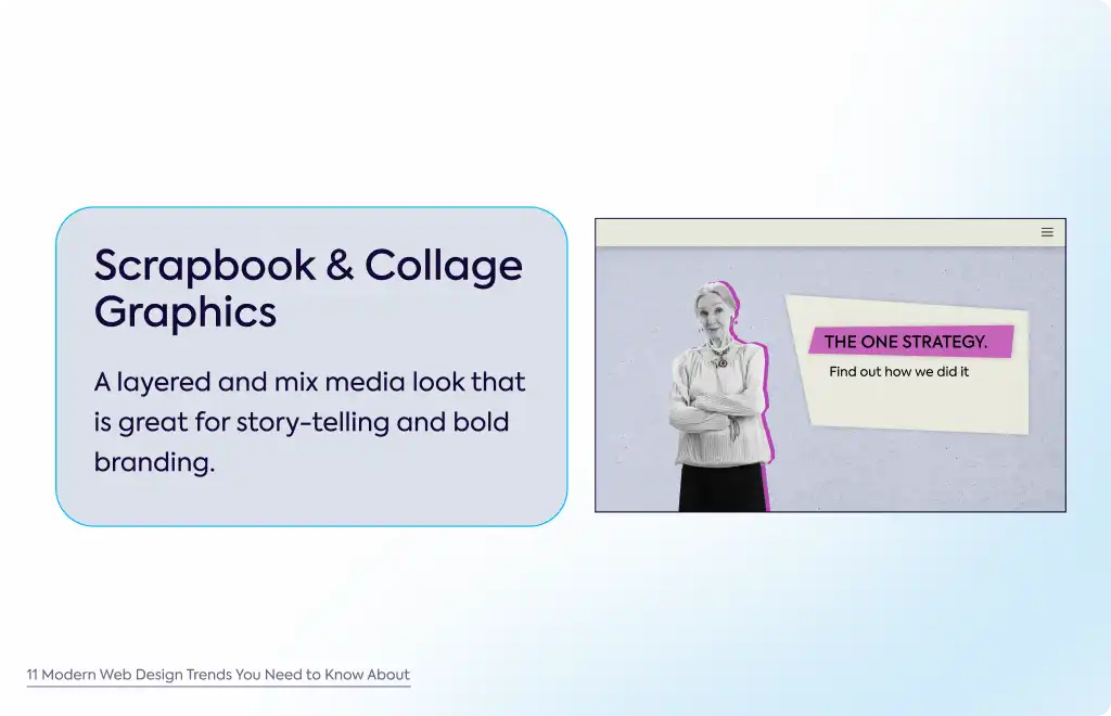
Scrapbook and collage-style graphics bring a layered, mixed-media look to website design, using a combination of images, textures, and hand-drawn elements.
This style often features overlapping visuals, cutouts, and playful arrangements that add a personal, nostalgic, or artistic touch to your website.
This approach is particularly effective for storytelling, as it adds depth and character to your site’s visuals.
It’s popular in creative industries, fashion, and lifestyle brands, where a dynamic visual narrative can convey a brand’s story in a compelling way.
Collage-style graphics help create a visually dynamic experience that captures the essence of your brand’s narrative.
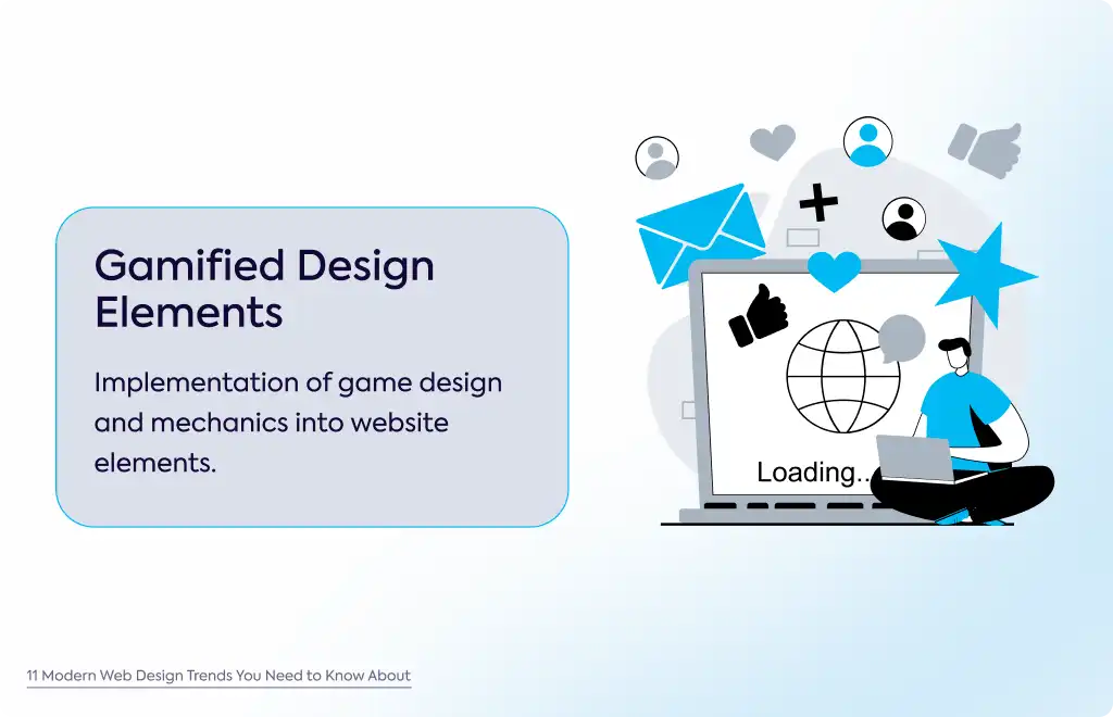
Gamified design elements introduce game-like features such as points, badges, and challenges to increase user engagement.
These elements make interactions on your site more enjoyable, encouraging users to spend more time exploring your content.
Incorporating quizzes, polls, and other interactive content not only boosts user interaction but also allows you to capture valuable user data.
By offering rewards for completing tasks, you can enhance user engagement, making visitors more likely to return.
This approach is particularly effective in e-commerce, education, and marketing websites, where building a loyal user base is key to success.
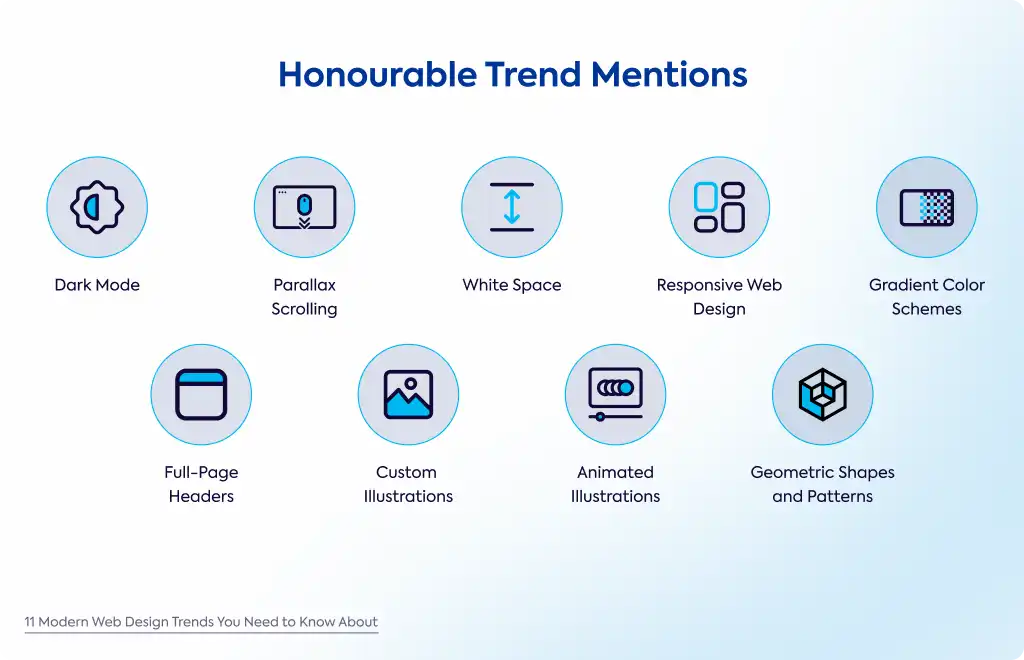
Dark mode has become a popular web design trend, offering a low-light user interface that reduces eye strain while providing a modern, sleek aesthetic.
It uses dark backgrounds with light text, making website elements stand out and creating a visually appealing experience that feels contemporary.
Parallax scrolling is a design effect where background elements move at a different speed than the foreground as users scroll through web pages.
This scroll-triggered interaction adds depth and visual interest, making the website more engaging and guiding users naturally through the content.
White space, or negative space, is an essential part of minimalist design.
It intentionally leaves parts of the webpage empty to highlight key elements and improve readability.
The organized layout draws attention to important areas, particularly the top-left, where users often focus first, making the design both functional and aesthetically pleasing.
Responsive web design ensures that your website adjusts and performs optimally across various devices, from desktops to mobile phones.
This approach prioritizes a seamless user experience by using grid layouts and navigation menus that adapt to different screen sizes, keeping the site accessible and visually consistent.
Gradient color schemes are a visual technique where colors transition smoothly from one hue to another, adding depth and a modern feel to backgrounds and other design elements.
These gradients align with current design trends, offering a vibrant and unique touch that enhances the overall aesthetic of the website.
Full-page headers are a design feature that occupies the entire screen width and height in the header section.
Often incorporating bold images, strong typography, and clear calls-to-action, especially in the hero section, they immediately capture the attention of site visitors and effectively highlight key elements.
Custom illustrations are bespoke, hand-drawn visuals tailored specifically for a brand.
Unlike stock images, these unique visuals add personality and make the website stand out, particularly in creative industries.
Custom illustrations offer a way to convey the brand’s story in a distinctive and personal manner.
Animated illustrations enhance custom visuals by adding motion, which increases user engagement.
These animations introduce interactivity and turn static content into something dynamic and visually interesting.
This approach adds depth and encourages users to explore more of the website.
Geometric shapes and patterns are often used in web design to create visually appealing and structured layouts.
Circles, squares, and other shapes help guide users through content in a way that feels organized and intentional.
This design choice not only improves the visual appeal but also aids in user navigation, making the site more user-friendly.
At Gauss, we know that effective web design is all about creating engaging, user-friendly experiences. Whether you're interested in adding micro-interactions, using kinetic animations, or focusing on sustainable design, we can help turn your ideas into reality.
User Engagement: Enhance how users interact with your site.
Modern Aesthetics: Keep your design fresh and relevant.
Sustainability: Optimize for both performance and functionality.
Ready to start? Contact us today to discuss how we can work together on your next project.
