Key Takeaways
- Responsive design uses flexible layouts and fluid grids to adjust web pages automatically across all devices, providing a consistent experience with one codebase.
- Adaptive design delivers predefined, static layouts tailored to specific screen sizes, offering more control over how the site looks on different devices.
- The difference between responsive and adaptive design lies in adaptability: responsive design fluidly adjusts, while adaptive design serves distinct layouts.
- Use adaptive design for projects targeting specific devices or when retrofitting existing sites, while use responsive design for broader compatibility across unknown devices.
- Each method has pros and cons: responsive designs simplify maintenance but may have slower load times, while adaptive designs allow faster loading and better control but require more development work.
What is Responsive Design?
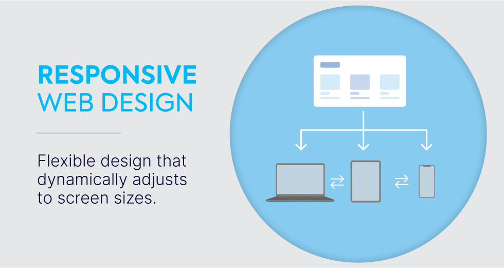
Responsive design is an approach that ensures your website looks great and functions well on any device, whether it’s a desktop, tablet, or mobile phone.
Instead of creating separate designs for each device, a responsive web design uses flexible layouts and fluid grids that automatically adjust to fit the screen size.
This way, the same site can smoothly adapt to different devices, giving users a seamless experience without the need for multiple versions of the site.
A key part of this process involves CSS media queries, which allow the website to change its appearance depending on factors like screen width and orientation.
As the screen size changes, these media queries adjust elements such as display type, width, and height, ensuring that the website layout looks right on every device.
With responsive websites, the content and design remain the same across all platforms, but they are rearranged to match the viewer's screen.
This technique, first popularized in 2010 by Ethan Marcotte, uses breakpoints—specific points where the layout shifts based on screen size.
Over time, creating a responsive design has become the preferred method for building mobile-friendly websites that can dynamically adjust to screen size changes.
What is Adaptive Design?
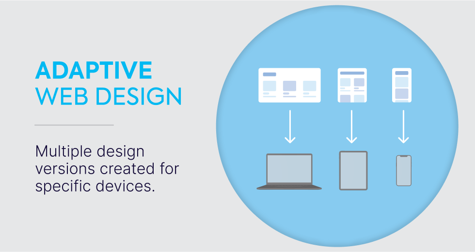
Unlike responsive web design, adaptive web design takes a different approach by creating multiple static layouts, each specifically tailored to certain screen sizes.
When someone visits the site, it detects the screen size and delivers the appropriate layout.
This means you are providing a custom experience for different devices, such as phones, tablets, or desktops, instead of one layout that adjusts dynamically.
To make this work, adaptive websites need several versions of the same site, each optimized for different breakpoints.
This can involve more upfront development, as the design requires creating multiple layouts for each target screen size.
However, the benefit is that each device gets a version of the site that’s specifically designed for its needs.
This method is often used to retrofit existing websites that need to be updated for mobile without changing the entire design from scratch.
Introduced in 2011 by Aaron Gustafson, adaptive design allows for more precise control over the user experience on specific devices.
So, if you're building an adaptive website from scratch, you'll be ensuring that each device gets a layout that's optimized for its screen size, but it also means maintaining multiple versions as technology evolves.
Responsive vs. Adaptive Design: Key Differences
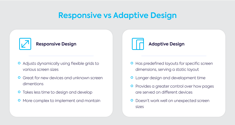
When choosing between responsive vs adaptive design, the main difference comes down to how each method handles various screen sizes.
Responsive design adjusts dynamically, using flexible grids and CSS media queries to change the layout based on the size of the user’s screen.
This approach is fluid and ensures that your website will automatically adapt, whether it's viewed on a mobile phone, tablet, or desktop.
This flexibility makes it a strong option for projects where you need to accommodate unknown or new devices.
In contrast, adaptive design requires predefined layouts for specific screen sizes.
Rather than adjusting on the fly, adaptive design detects the device type and serves a static layout tailored to that screen size.
For example, you might have separate layouts for 320px, 960px, and 1200px screens, which makes it possible to offer a more customized experience for each device.
However, this also means that adaptive design doesn’t work as smoothly for unexpected screen sizes or new devices.
One key difference between adaptive and responsive design is that responsive websites use a single codebase for all devices, while adaptive design creates multiple versions of the site.
Unlike responsive design, which fluidly changes as the viewport size changes, adaptive websites require specific layouts for each device, which could mean more work in terms of development and maintenance.
Both methods have their strengths. Responsive design tends to work best for new websites that need to function across a broad range of devices, while adaptive design is often used for retrofitting older sites to make them mobile-friendly.
Additionally, if you need more control over how the website appears on specific devices, adaptive design offers that precision.
However, responsive design is typically better for handling a wide variety of screen sizes without needing to account for every single one.
Responsive Design vs. Adaptive Design: Pros and Cons
Choosing between these two approaches depends on your website’s goals, and there are clear pros and cons to each option.
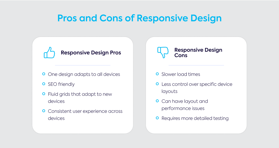
Responsive Design:
Pros:
- One design adapts to all devices, reducing maintenance.
- SEO-friendly, preferred by Google for mobile rankings.
- Fluid grids allow for flexible design that adapts to new devices.
- Consistent content and user experience across devices.
Cons:
- Slower load times, as all code is delivered regardless of device.
- Less control over specific device layouts.
- Can result in layout or performance issues on some devices if not properly optimized.
- Requires careful testing to ensure usability across different screen sizes.
Adaptive Design:
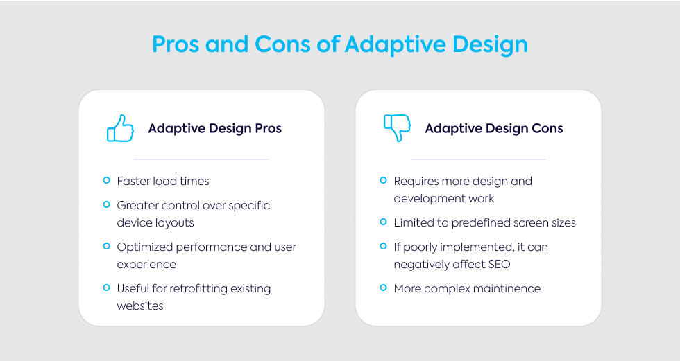
Pros:
- Faster load times, as only necessary resources are delivered for the detected device.
- Greater control over specific layouts and content for each device.
- Allows for optimized performance and user experience on targeted devices.
- Useful for retrofitting existing websites for mobile-friendliness.
Cons:
- Requires more design and development work to create multiple versions.
- Limited to specific, predefined screen sizes; may not cover new or unusual devices.
- Can negatively impact SEO if not implemented properly.
- Maintenance is more complex with multiple codebases to manage.
When to Use Responsive vs. Adaptive Design
Choosing between adaptive vs responsive design depends largely on the specifics of your project.
Each approach offers distinct advantages depending on the scope and goals of the website, especially in terms of the devices your audience is likely to use.
Project Scope and Requirements
If you’re building a new website from scratch, responsive design is often the better choice.
It’s particularly well-suited for large-scale design projects that need to work smoothly across a variety of devices and screen sizes.
Responsive sites use design strategies that automatically adjust based on screen size, making them ideal for websites with lots of content and a diverse user base accessing the site from different devices.
On the other hand, adaptive design is generally more useful for projects that involve retrofitting or redesigning an existing site.
This approach works best if you're targeting specific devices, such as iPhones or tablets, as it allows you to create layouts tailored to those screens.
When choosing between responsive and adaptive design, consider how much control you need over the user experience on each device.
Adaptive design is more labor-intensive because it requires building separate layouts for each screen size, but it can offer more precision in how your content appears.
If your website for different devices has budget or resource limitations, responsive design might be the more practical option, as it typically involves less upfront work and simpler long-term maintenance.
For adaptive design, existing user analytics can guide your decision, helping you identify which devices your audience uses most frequently and tailoring the design to those screen sizes.
User Experience and Performance
Both responsive design and adaptive design impact the user experience, but the way they handle performance is different.
Responsive design provides a fluid, consistent experience across all devices. It automatically resizes and rearranges content based on the screen size.
However, this flexibility can come at the cost of longer load times, as the browser needs to download all the website’s code, regardless of the device.
This can be a problem, especially on mobile devices with slower connections, and can sometimes result in a less-than-optimal experience.
In contrast, adaptive design loads only the necessary resources for each specific device, which means faster load times and better performance.
This method ensures that the mobile design or desktop version of the site is tailored exactly to the screen, making it a good choice for sites that prioritize performance on particular devices.
The downside is that users on devices with less common screen sizes may not have as smooth an experience.
With adaptive design, you also have the ability to prioritize content based on the device.
For example, mobile users might see mobile-focused features first, while desktop users can access a broader range of content.
Testing is critical for both methods to ensure that the UX design—including visual hierarchy and ease of use—remains consistent across all devices.
Mobile-First Design Considerations
Today, a mobile-first design approach is often a smart strategy.
Since most users access the web through their phones, designing for smaller screens first ensures that your site is optimized for mobile devices before scaling up for larger ones like tablets or desktops.
A key part of mobile-first design is focusing on performance.
Ensuring fast load times is crucial, as slow pages can drive users away.
When designing for mobile, you’ll need to pay special attention to factors like UI design, making sure that buttons are large enough for users to tap easily and that text is legible on smaller screens.
Navigation should also be simplified for mobile users.
Features like hamburger menus or sticky headers can help streamline the user experience and reduce clutter.
Since screen space is limited, it’s essential to prioritize important content using a clear design thinking approach to establish visual hierarchy.
This ensures that users see the most important information first, rather than being overwhelmed by large blocks of text or images.
When tailoring your design, it’s important to consider how users interact with different devices.
Optimizing buttons and interactive elements for touch is key, as smaller screens rely heavily on finger taps rather than clicks.
Using data from analytics tools can help you understand which devices are most popular with your users, allowing you to tweak your mobile website accordingly.
Lastly, testing your site across a range of devices and screen sizes will ensure that your mobile-first design is performing as expected.
Common Mistakes to Avoid
Responsive Design Mistakes
While responsive design is a powerful tool, it’s not without its challenges.
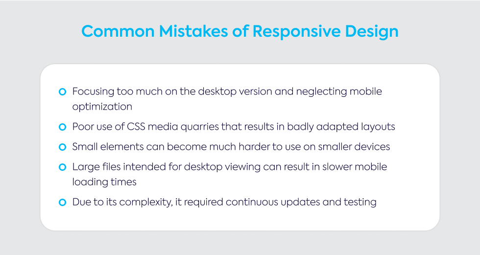
One common pitfall is focusing too much on the desktop version and neglecting mobile optimization.
This can lead to a poor experience for users on smaller screens, which is especially problematic since more users now browse the web on mobile devices.
Another frequent issue comes from the improper use of CSS media queries.
If these queries aren’t set up correctly, you can end up with layouts that don’t adapt well to different devices.
Small elements like buttons or interactive features can become hard to use on mobile, making navigation difficult for users.
Overloading a responsive site with unnecessary content or large images intended for desktop can also slow down mobile load times.
This is a common mistake that impacts both performance and user satisfaction.
Failing to test your responsive layouts across a variety of devices can lead to unexpected problems, so thorough testing is key.
Lastly, responsive design is often more complex to implement and maintain over time.
It’s important to plan for ongoing testing and updates to ensure the design continues to work smoothly as new devices and screen sizes emerge.
Adaptive Design Mistakes
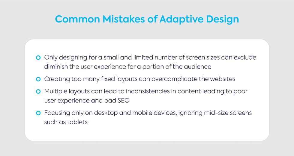
With adaptive designs, one mistake is designing for only a limited number of screen sizes.
While focusing on popular devices makes sense, it’s easy to overlook uncommon or new screen dimensions, which can lead to poor experiences for those users.
Creating too many fixed layouts can also overcomplicate your adaptive site.
While you want the site to look good on various devices, adding too many layouts can make the design harder to manage and maintain.
It’s also important to avoid inconsistencies in content across different versions of the site.
This not only
confuses users but can also harm
your site’s SEO rankings.
Misidentifying devices or screen sizes can result in users seeing the wrong layout, causing frustration.
For example, a tablet user might be served a mobile layout, which may not be ideal for their experience.
Lastly, it’s easy to get caught up in focusing only on major devices like mobile phones and desktops while neglecting middle-range devices like tablets.
As more hybrid devices come into use, design issues like these will become increasingly important to address.
Struggling with choosing between Responsive and Adaptive Web Design for your next project?
At Gauss, we understand the challenge of selecting the right design approach—whether it’s the flexibility of responsive design or the precision of adaptive design.
Your decision directly impacts user experience, performance, and the scalability of your site.
Our team of experts is ready to help you make the right choice and create a custom solution that fits your unique project needs.
Whether you want to retrofit an existing site or build something new, we’ll ensure your website performs beautifully on every device.
Start a conversation with us today to explore how we can bring your vision to life! Contact Gauss.
To learn more about our web development services, visit here. Let’s build something great together!
