Key Takeaways:
- Focused user engagement: Modals ensure user attention by disabling interaction with background content until the action within the modal is completed. This focused design element helps deliver key messages effectively.
- Efficient space usage: Modals present additional content like forms or media within the same web page, keeping the interface uncluttered and avoiding navigation away from the page.
- Improved user experience: When designed thoughtfully, modals guide users through processes like sign-ups, confirmations, or media viewing, enhancing the overall user experience and improving conversion rates.
- Accessible design: Properly design your modals by making them keyboard-navigable and providing clear exit options, ensuring all users can interact with them easily.
- Balanced usage: Overusing modals or presenting them too frequently can lead to modal fatigue. Limit modals to critical interactions and consider alternatives to keep the user flow uninterrupted.
What is a Modal in Web Design?
Defining a Modal
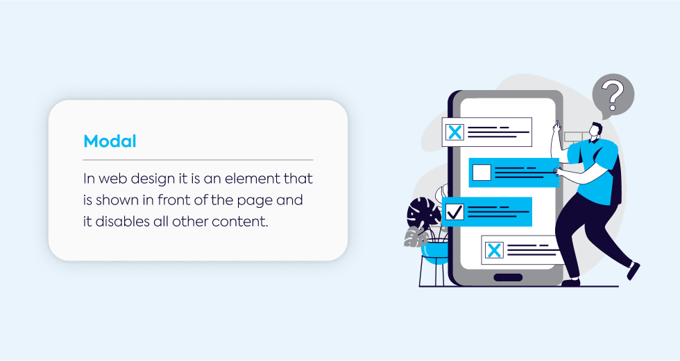
A modal in web design is essentially a modal window that overlays a webpage and temporarily disables interaction with the rest of the site.
You’ve likely encountered them when websites display alerts, confirmation prompts, forms, or media like images and videos.
These windows appear over the main content and usually require some form of user input to close or complete the action within them.
The purpose of the modal is simple: it grabs your attention and makes sure you focus on a specific action or piece of content.
It’s not just a pop-up that you can ignore or close without engaging—once the overlay appears, you're often required to interact with it before you can return to the rest of the site.
Modal vs. Pop-up
At first glance, you might think that a pop-up and a modal serve the same purpose, but they are quite different.
The key difference in the debate of modal vs. pop-up is how they handle user interaction.
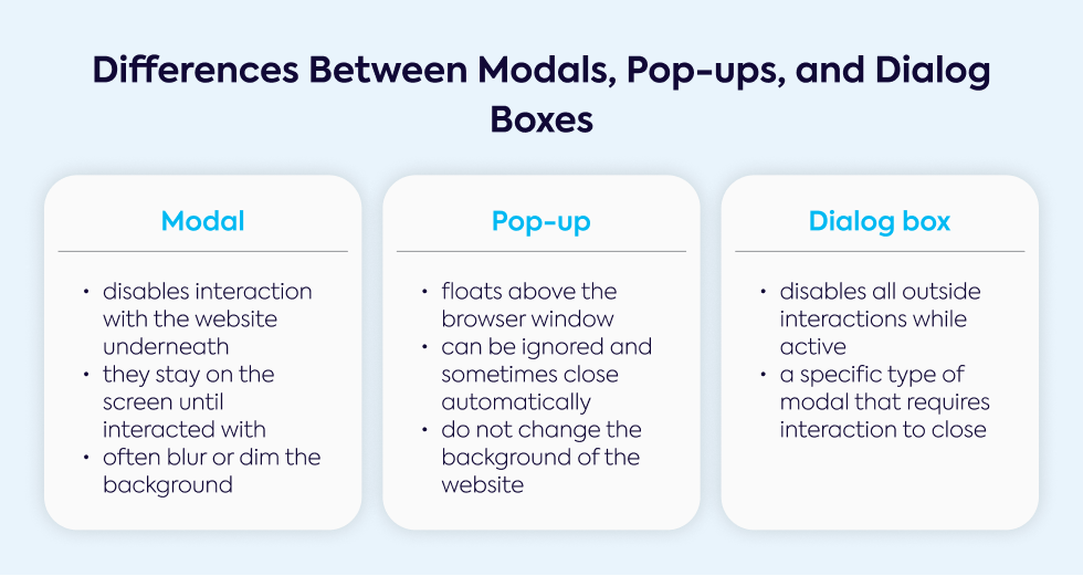
A modal completely disables interaction with the page underneath, while a pop-up doesn’t—it floats over the browser window and can be ignored or closed without requiring immediate action.
Whereas modals stay on the screen until you engage with them, pop-ups can sometimes close automatically or be dismissed with ease.
Another distinction is that while a pop-up might not always dim or blur the background, modals often use this effect to help users focus on what’s inside the window.
Modal vs. Dialog Box
In website design, a dialog box is a general term that refers to any small window that pops up, usually asking for some form of interaction.
A modal dialogue is actually a specific type of dialog box that forces the user to focus on it by preventing interaction with the main content.
Unlike other dialog boxes that might let you shift between tasks in the main window, when a modal is active, you’re locked into it until you address whatever action it’s asking for, whether it’s submitting a form, reading a message, or confirming an action.
Benefits of Using Modals in Web Design
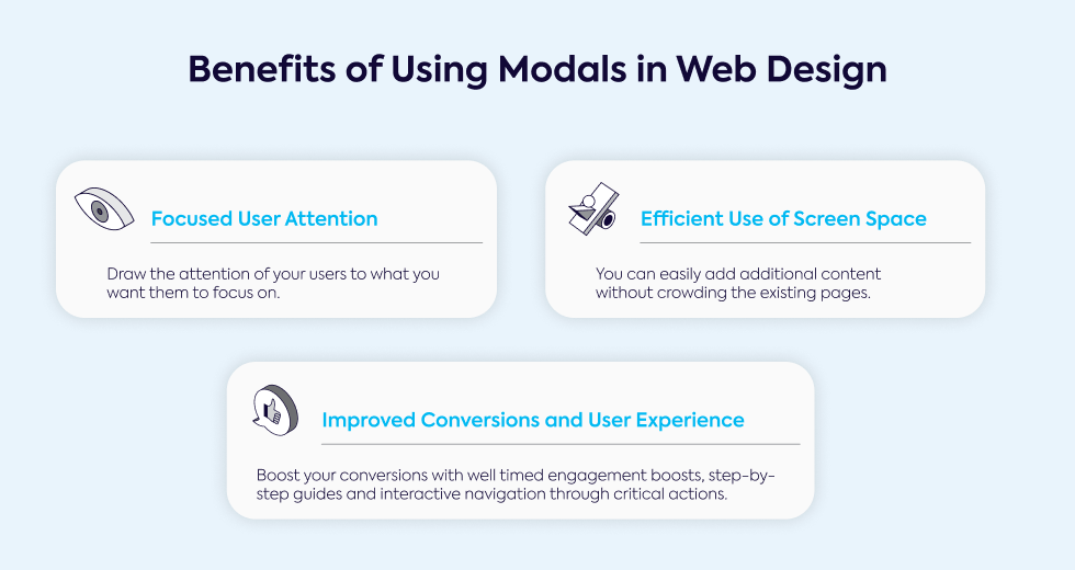
Focused User Attention
Modals are great tools for ensuring user experience is smooth and focused.
They block the background and deactivate other page elements, guiding you toward a piece of information or action that needs your attention.
For example, important alerts, confirmations, or tasks like completing a purchase can be highlighted this way.
Because they isolate the content within them, modals reduce distractions, which makes them an ideal solution for key messages that need to be addressed before continuing with the rest of the site.
Efficient Use of Screen Space
Another benefit is how modals display extra content without taking you away from the current page.
You might encounter a lightbox when clicking an image or video that opens up in a larger view, allowing you to stay on the same page.
This keeps things simple because you can view additional modal content without navigating elsewhere.
In a design sense, modals help websites remain visually clean and uncluttered.
They pop up when needed but don’t permanently occupy space, letting users engage with the extra content without leaving the main page.
Improved Conversions and User Experience
Modals are commonly used for boosting conversions.
For instance, a confirmation modal can ask for your approval before finalizing an important decision, like submitting an order or deleting an account.
When set up well, they are excellent tools to guide users through a multi-step process like sign-ups or surveys, keeping the focus and preventing distractions.
They also help guide users through critical actions by emphasizing key calls-to-action, like subscribing to a newsletter or confirming a purchase.
Well-timed modals can increase engagement and ensure tasks are completed.
Types of Modals in Web Design
Informational Modals (Alerts and Notifications)
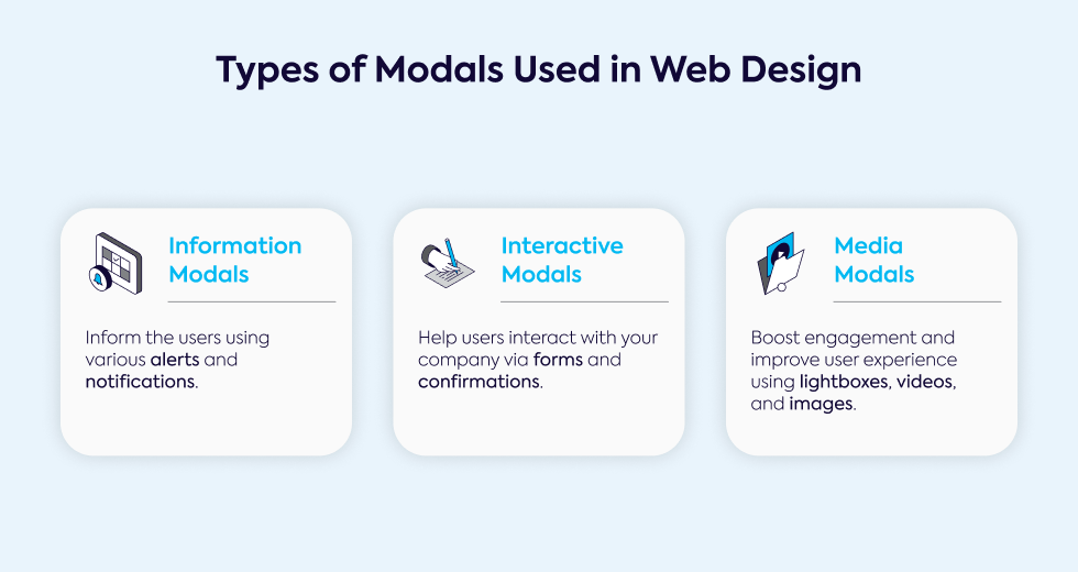
An informational modal window is typically used for critical alerts or important messages, such as warnings or updates.
These modals are common for things like cookie policies, age verification, or system errors, and they often require users to acknowledge the information before moving on.
Good examples include alerts used on sites like Adidas for member sign-ups or GPen for age verification, ensuring users take the required action.
These modals are often optimized for web accessibility, allowing them to be used by all types of users, including those with disabilities.
Interactive Modals (Forms and Confirmations)
Interactive modals require direct engagement from the user.
Whether you're filling out a form to log in, sign up, or provide feedback, these modals keep the process contained without taking you away from the page.
When a user must enter details, such as login credentials or email sign-ups, the modal keeps the focus on the task at hand.
Often triggered by clicks or scrolls, these types of modals also include confirmation prompts for irreversible actions.
For example, modal prompts are frequently seen in sign-up processes, like on Pinterest, or when confirming account deletion.
Media Modals (Lightboxes, Videos, and Images)
Lightbox modals are often used to showcase images, galleries, or videos by focusing on the media itself while dimming the background.
This ensures users can engage fully with the media without distractions.
The design of a media modal makes it easy to view larger versions of images or play videos within the window.
Because a modal allows you to stay on the same page, you don’t have to navigate elsewhere to interact with the media.
Sites like Starry use this technique for video tutorials, while product images are often displayed in lightboxes to provide a better viewing experience.
When to Use Modals in Web Design
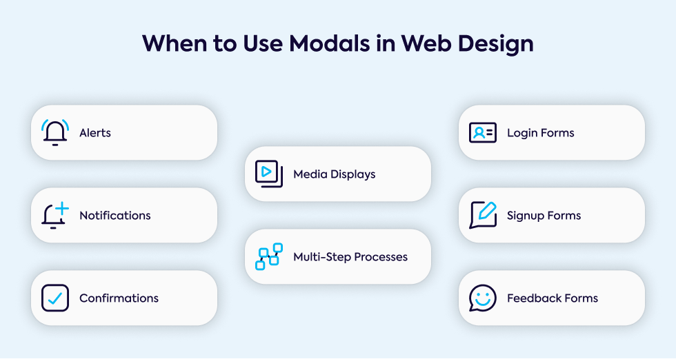
Alerts, Notifications, and Confirmations
You’ll often see modals used for critical tasks like notifications or confirmation modals that require immediate action.
These modals typically display important information and require you to interact with them before returning to the current page.
Whether it’s a warning, an error message, or a session timeout, these modals appear to ensure you acknowledge the information.
Actions like deleting an account or confirming a purchase often trigger these modals, ensuring you don’t overlook important steps.
Forms (Login, Signup, Feedback)
Another common use is for modal window forms, such as login or sign-up forms that ask you to enter data without navigating away from the page.
By placing the form within a modal, the site maintains focus on the task.
Whether it’s a login/signup prompt or a feedback form, modals allow users to complete forms while staying on the current page.
For instance, you might see a modal appear when clicking outside or while signing up for a newsletter, guiding users smoothly through the process.
Media Displays
When websites want to show larger images, videos, or galleries, media modals are often used.
These modals make it easy to engage with the media while keeping you on the same page.
Whether you’re browsing a product gallery or watching a video, the modal creates a space where you can focus on the media without leaving the main page.
This type of modal content is especially useful for portfolio galleries or product showcases, where images and videos need to be presented in a distraction-free way.
Multi-Step Processes
Some websites use modals to break up a multi-step process into manageable sections.
Rather than overwhelming users with too much information at once, each step of the process appears in a separate modal.
For example, when completing a sign-up form, a modal might ask for personal details in one step and payment information in the next.
These processes often include a progress indicator so users can track their progression through the steps.
The design ensures that each task is tackled individually without disrupting the flow of the main page.
Modal Window Best Practices
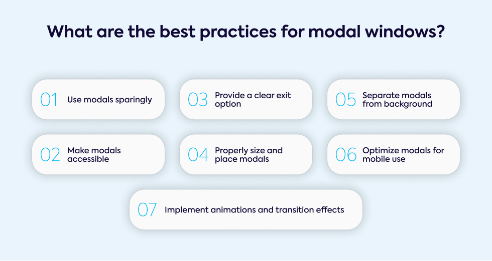
Use Modals Sparingly
Modals are often used to highlight important actions or alerts, but you should be cautious about overusing them.
Too many modals can overwhelm visitors and create a negative experience.
A well-designed modal should align with the user’s goals, rather than interrupting their flow with non-essential information.
Overuse can lead to frustration, causing users to abandon the site.
To prevent this, limit the number of modals per session and ensure each one serves a necessary purpose.
Make Modals Accessible
When designing modals, web accessibility should be a priority. Ensure that everyone, including those with disabilities, can interact with the modal.
This includes enabling keyboard navigation (using the tab key to move between elements and the escape key to close).
Use ARIA attributes to describe the modal for screen readers, and make sure there's enough contrast between the modal and the background.
If your modal includes images or media, add alternative text to support assistive technologies.
Provide a Clear Exit Option
Every modal should give users the option to close the modal easily. A visible "X" button at the top or a "Close" button inside ensures users can exit quickly.
Additionally, allow the use of the escape key or let users close the modal by clicking outside its boundaries.
Making it easy to close the modal enhances the user experience and prevents frustration.
Proper Sizing and Placement
A well-designed modal shouldn’t take over the entire screen or be too small to read.
Ideally, a modal should cover no more than 50% of the screen width and be centered both vertically and horizontally.
Ensure it's large enough to comfortably read the content but not so big that it resembles a full webpage.
Test modals with screen readers to ensure accessibility for users with visual impairments.
Separate Modal from Background
To help users focus on the modal's content, create a clear visual separation between the modal and the rest of the page.
This can be done by dimming the background or adding drop shadows to bring the modal forward.
Additionally, ensure that background content is not interactive. If users click outside the modal, they should not accidentally interact with the underlying page.
Mobile Optimization
When designing for mobile devices, modals should be responsive and adjust to various screen sizes.
A modal that’s too large can become difficult to navigate on smaller screens.
Consider alternatives like modeless elements or creating separate mobile-optimized pages for certain actions.
Test modal designs on multiple devices to ensure the experience is smooth, and ensure interactive elements are large enough for users to tap easily.
Animation and Transition Effects
Smooth transitions can enhance the overall experience when a modal pops up.
Use gentle animations like fade-ins and fade-outs that are subtle and quick.
Avoid flashy or distracting effects that could take attention away from the modal's content.
These transitions make the user experience smoother and help users understand when a modal is appearing or closing.
How to Implement Modals in Web Design
Using HTML and CSS for Simple Modals
You can create a basic modal window using only HTML and CSS.
The HTML provides the structure (text, buttons, and images), while CSS takes care of the styling, placement, and basic interactivity like showing and hiding the modal.
Modal visibility can be controlled with CSS properties like display: none; and visibility: hidden;, and CSS classes can trigger simple animations or effects such as background dimming.
JavaScript for Interactive and Dynamic Modals
For more advanced functionality, use JavaScript.
It allows the modal to become interactive, responding to user actions. Event listeners, such as clicks or form submissions, can show or hide the modal as needed.
JavaScript also enables modals to change content dynamically without page reloads and handle features like form validation or multi-step processes to enhance user interaction.
Popular Libraries for Modals
Several libraries simplify building modals. Bootstrap modals are widely used, offering customizable options for responsive modals with built-in support.
Vue.js modals integrate easily into component-based architectures, while libraries like SweetAlert2 or React Modal provide more complex features such as alerts and confirmation prompts without needing to build from scratch.
Potential Downsides and Alternatives to Modals
Overuse of Modals
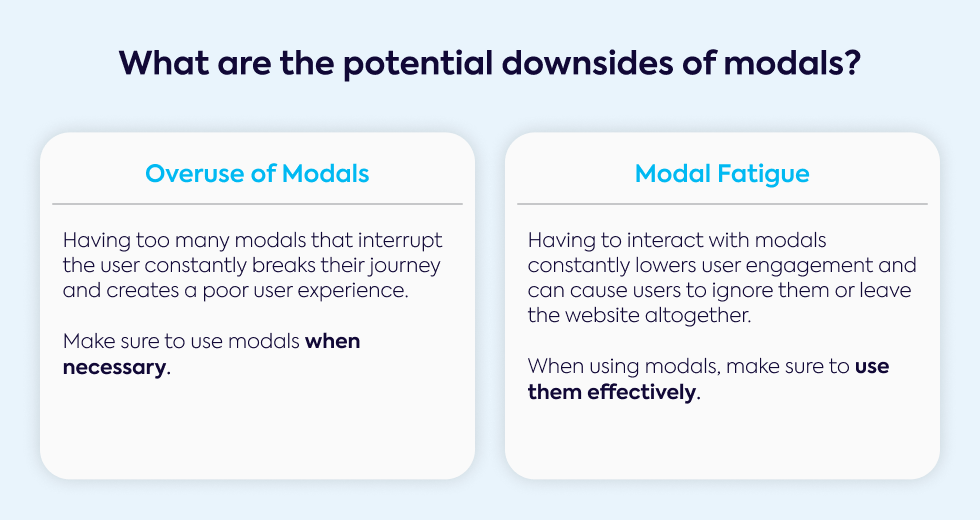
While modals are useful, overuse can lead to poor user experiences.
Too many modals can interrupt user flow, causing frustration and higher bounce rates.
To avoid this, use modals only when necessary, such as for critical alerts or actions.
Modal Fatigue
Modal fatigue occurs when users are exposed to too many modals, leading to disengagement.
Repeated modal appearances may cause users to dismiss them without interacting, which lowers engagement and conversion rates.
This negatively impacts the user experience and perception of the website.
Alternatives to Modals
To avoid overusing modals, consider alternatives like inline content, which displays information without interrupting workflow.
Slide-in panels or tooltips offer contextual information without blocking the interface.
Expandable sections and toast messages provide more subtle ways to engage users without disrupting their experience.
Future Trends in Modal Design
Increased Focus on Accessibility
As web design evolves, there's growing emphasis on making modals accessible.
Features like ARIA attributes support users with disabilities, ensuring modal content is announced to assistive technologies like screen readers.
Modals should also support keyboard navigation, allowing users to interact with and close modals using the tab or escape keys.
Personalization and AI-Driven Modals
In the future, expect more AI-driven modals that tailor content based on user behavior, location, or past interactions.
These modals ensure content is relevant and engaging, appearing at the right time to guide users toward conversions, improving the overall user experience.
Evolving UX Patterns
Designers are shifting toward less intrusive options like micro-modals or slide-ins, which fit seamlessly into the user experience.
Responsive modals are also growing in popularity, adapting to multiple devices and using smoother animations.
Expect modals to be deployed more sparingly, enhancing engagement without interrupting the user flow.
Start Your Next Project with Gauss: Let's Bring Your Web Design to Life
You've just learned the best practices for modal design and how to make modals a powerful tool for user engagement and experience.
Now, imagine having a dedicated team to help you implement these strategies—customized to your unique needs.
At Gauss, we specialize in creating tailored IT solutions that enhance user experience and streamline your design process.
Whether you're looking to develop an intuitive modal or a full-scale project, we're here to bring your vision to life.
Ready to transform your ideas into reality? Contact us today to start a conversation about how Gauss can help you achieve your web design goals.
