Key Takeaways
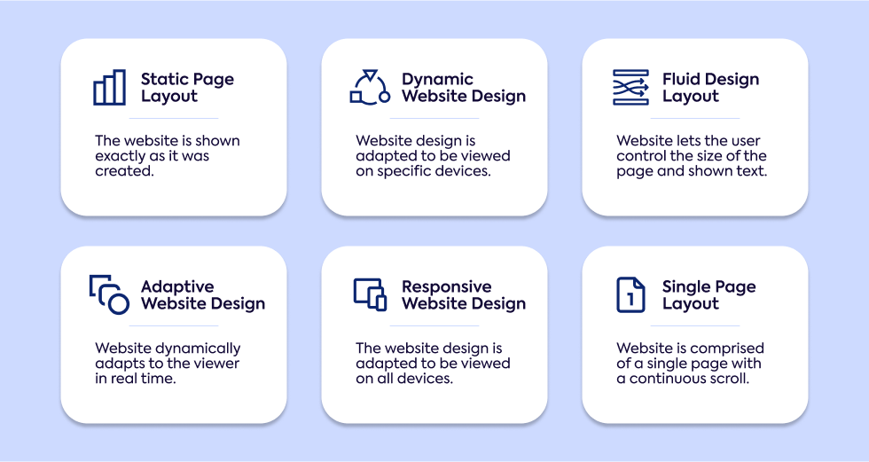
- Static Page Layout: A simple, fixed web design format that doesn’t adjust to different screen sizes. It's easy to create but outdated for mobile use, making it less common today except for portfolios or journals.
- Dynamic Website Design: Provides an interactive experience where content changes based on user input. It’s complex and slower but perfect for online stores and platforms with frequent updates.
- Liquid (Fluid) Design Layout: Uses percentages to adapt to various screen sizes, offering more flexibility than static layouts. However, content may appear awkward on very large or small screens.
- Adaptive Website Design: Adjusts to pre-set screen sizes, offering more control for a business website but may not display perfectly on uncommon screen dimensions.
- Responsive Website Design: The most versatile, automatically adapting to any device or screen size for a seamless experience regardless of the browser. Best suited for reaching users across multiple devices and offers SEO benefits.
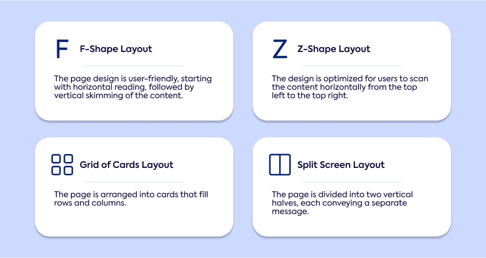
- Popular Web Layouts That Enhance Design: F-shape and Z-shape layouts guide users' eyes to key areas on the page, while grids of cards and split-screen designs keep content organized and improve navigation.
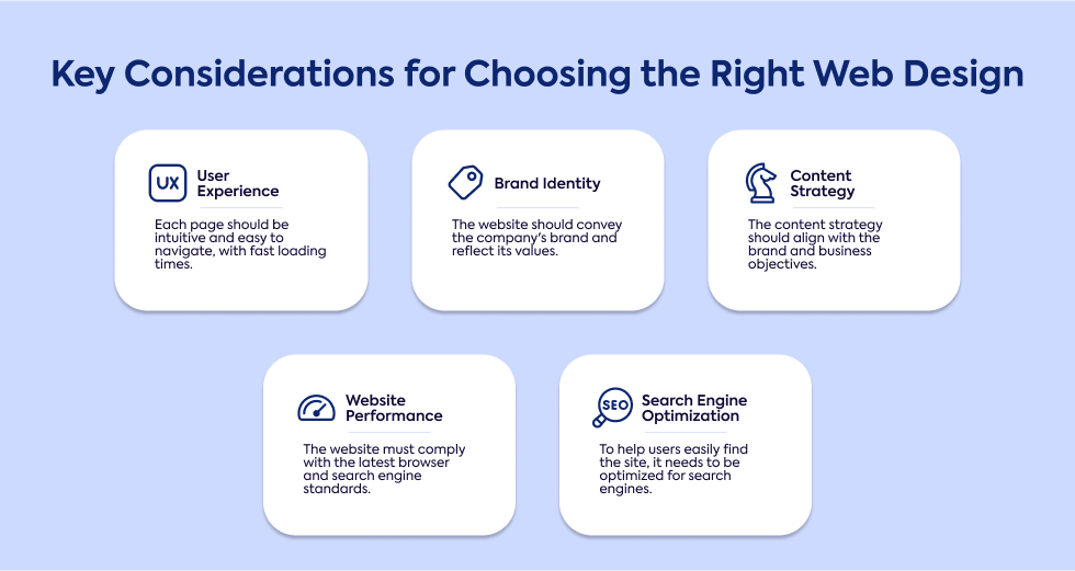
- Key Considerations for Choosing the Right Web Design: Prioritize user experience and align your design for your website with your brand identity. Optimize content and performance to boost SEO for every website, ensuring fast load times and mobile-friendly design for building the best website for your business.
Core Types of Web Design

Static Page Layout
When it comes to a static page layout, you're looking at a straightforward, no-frills option. This design has fixed page dimensions that don't adjust to different screen sizes. A website with pre-set page dimensions is simple to create and doesn’t require advanced coding skills.
While this approach used to be common, static websites have fallen out of favor due to the rise of mobile browsing. If you want a mobile-friendly experience with this design, you'll need to create a separate version specifically for mobile.
Despite being phased out, static layouts are still an option for certain uses like portfolios, brochures, or journals. These websites offer minimal interactivity and tend to be lower-cost compared to more dynamic or responsive formats.
Dynamic Website Design
A dynamic website provides an interactive experience for users, delivering different content depending on user inputs or interactions.
Unlike static layouts, dynamic website design is more complex, requiring flexible coding languages like PHP, JavaScript, or ASP.
This type of site is ideal for online stores, search engines, and platforms where real-time updates are key. Because dynamic website layouts require more processing, these sites tend to load more slowly than their static counterparts.
If you're running a site with high user engagement or frequent updates, this type of website design will serve your needs well, but it can be trickier to maintain.
Liquid (Fluid) Design Layout
If you're looking for flexibility, liquid design might be a good fit. This layout uses percentages instead of fixed units, allowing your site to stretch or shrink depending on the device's screen size.
Liquid website design ensures that no content gets cut off, but there’s a trade-off—if the screen size is too large or small, the layout can appear awkward.
This fluid design offers more flexibility than static layouts but doesn't fully match the adaptability of responsive designs.
For blogs or other website types that have lots of content, a liquid layout can be a suitable choice, especially if you prioritize displaying all content without cutoff.
Adaptive Website Design
An adaptive website adjusts based on the size of the user's browser. Unlike fluid layouts, which adjust continuously, adaptive designs respond to pre-set screen sizes.
Adaptive website design relies on CSS queries to shift the layout, often based on common screen widths like 480, 960, or 1200 pixels.
This makes development faster than full responsive design but leaves gaps in flexibility. If a user’s device doesn’t match one of the pre-set screen sizes, they might see stretched content or white space.
This approach works well for eCommerce websites, membership websites, and other business-focused sites where you need more control over how things look on specific devices.
With the right design approaches, adaptive websites can deliver a smooth experience for website visitors across multiple screen sizes.
Responsive Website Design
The most versatile design approach is responsive design, which automatically adjusts your website’s layout to fit any screen size.
Responsive web design uses CSS media queries to ensure fluid adaptation across devices, creating a consistent user experience on desktops, tablets, and smartphones.
While developing a responsive design takes more time and resources, the result is well worth it. You won't need to create separate mobile versions, and you'll also get a boost in SEO & performance. For businesses, blogs, or eCommerce platforms that aim to reach users across multiple devices, this is the example of responsive design that works well everywhere.
Single Page Layout
A single page website presents all its content on one long, scrolling page. This style simplifies navigation, making it easier for visitors to browse through your offerings without needing to click through multiple pages.
Single page website designs are commonly used for product pages, online resumes, and landing pages where simplicity and quick navigation are key.
While this single-page design works well for straightforward purposes, it may not be ideal for businesses that require more complex structures or a wide range of products.
For product pages, this layout can streamline the user experience, but too much scrolling can turn visitors away if the content is too lengthy.
Popular Web Layouts That Enhance Design

F-Shape Layout
The page layout for content-heavy websites often follows an "F" shape. Studies have shown that users tend to scan web pages in an "F" pattern, concentrating their attention on the top and left sides of the page.
When you use an F-shape layout, it's important to position critical elements like headlines, images, or calls to action where users are most likely to see them.
This structure works particularly well for website design styles that prioritize long-form content, such as blogs or news sites.
Because so many impressions rely on web design, keeping important information aligned with natural eye movement ensures it doesn't get missed.
Z-Shape Layout
For simpler, more visually oriented pages, the website layout might follow a "Z" shape. Users’ eyes start at the top-left, move across to the top-right, then diagonally down to the bottom-left, and finish at the bottom-right.
This layout is especially effective for design trends that focus on minimal content, like landing pages or advertisements.
If you're designing a stunning website with clear focal points, a Z-shape layout can guide visitors through your site efficiently, ensuring key messages or calls to action are in the most impactful places.
Grid of Cards Layout
When your site needs to organize a lot of content, a website content approach using a grid of cards might be best. This design breaks content into small, digestible pieces that are visually appealing and easy to navigate.
Website into two sections or more allows users to browse through information without feeling overwhelmed.
Commonly seen on platforms like Pinterest or Instagram, this design is well-suited for trending formats of website design that require a responsive, mobile-friendly approach.
Whether you run a media gallery, eCommerce store, or blog, grids of cards are an efficient way to keep your content structured and user-friendly.
Split Screen Layout
A website to help visitors make clear choices often uses a split-screen design. This layout divides the page into two or more sections, making it easy to showcase contrasting content or direct users to different areas.
For example, if you're offering two key services, the split-screen layout can give equal emphasis to both. This style highlights different aspects of a website, helping users quickly find the information they’re looking for.
It works well for landing pages or service-based businesses where guiding users toward specific actions is critical. Website designers often use this approach to provide clarity in navigation and enhance user decision-making.
Key Considerations for Choosing the Right Web Design

User Experience (UX)
When it comes to user experience, first impressions are everything. Research shows that 94% of first impressions are tied to the design of the site.
A well-designed website should be intuitive, easy to navigate, and engaging for users. A positive user experience means visitors can find what they need quickly without any confusion.
Responsive design plays a major role here by ensuring your site adapts well to different devices and screen sizes.
Slow page loading speeds can frustrate users and lead to drop-offs, so keeping things fast and efficient is essential.
Utilizing whitespace effectively can also improve readability, helping to create a functional website that feels smooth and clutter-free.
Brand Identity
Your website is a reflection of your brand, and its design should communicate that clearly. Brand identity goes beyond just a logo or color scheme—everything from typography to layout reinforces your brand's message.
A minimalist web design can help emphasize your brand's core elements by cutting down on distractions.
Whether you're using bold colors or keeping things subtle, your design principles should align with your audience's expectations. Consistency across all pages is key to building trust and recognition with your visitors.
Content Strategy
For a blog website or other content-heavy platforms, your content strategy needs to align with both your brand and the needs of your audience.
Clear, well-structured content that is optimized for SEO is important for visibility. Websites with different web layouts may require varied content strategies, especially for things like product descriptions or articles.
Regular updates to content are important for keeping your site fresh and engaging. Whether you're offering products and services or running a blog, the right content approach will help you communicate effectively with your users.
SEO & Performance
To rank well on a search engine, your website needs to be optimized for performance as well as content. A website for your business that loads quickly and works well on mobile devices will see better SEO results.
Incorporating relevant keywords in headings, text, and metadata is important for visibility. Image optimization can help your site load faster, contributing to better SEO performance.
By combining a responsive design with fast load times and clean code, you'll create a site that not only performs well but ranks higher on search engines, attracting more visitors.
Ready to elevate your web presence with a design that truly works?
No matter which website design you choose - whether it's the simplicity of a static layout or the adaptability of responsive design - Gauss can help bring your vision to life.
We understand that choosing the right design can be overwhelming, especially when your business depends on user experience and brand consistency. That’s where we come in.
Let’s start a conversation today about how we can craft a custom solution tailored to your unique needs.
