Key Takeaways
- Website architecture is crucial for organizing pages on your website in a way that improves both SEO and user experience.
- A flat site architecture keeps key pages within 3-4 clicks, making it easy for both users and search engines to navigate.
- Strong internal linking connects different pages, helps distribute authority, and prevents orphan pages, improving SEO.
- A good site architecture supports smooth navigation and enhances the overall user experience by making the site easy to navigate.
- Apply SEO-friendly practices like using clean URL structures, clear main categories, and internal links to help search engines understand the content hierarchy.
- Follow website architecture best practices, such as using breadcrumbs and sitemaps, while optimizing for mobile and voice search to stay ahead.
What Is Website Architecture?
Website architecture refers to the way content and pages are organized on your site. It’s often described as a hierarchical structure, where the homepage sits at the top, followed by categories, subcategories, and individual pages. Think of it like a tree, where each branch leads to more detailed sections of the site. This structure not only helps your visitors easily navigate but also makes it easier for search engines to find and index your content.
Good website architecture improves both usability and SEO. It connects pages through internal linking, ensuring that authority flows through the site effectively. This internal link network supports easy navigation for users and assists search engines in understanding how your content relates to one another.
While information architecture looks at organizing data across various systems, website architecture focuses specifically on the structure of your website. The key components include navigation, breadcrumbs, sitemaps (both HTML and XML), and a clear URL structure. Ideally, you want a flat website architecture, where any page can be accessed within just a few clicks. This keeps things simple and user-friendly.
Why Is Website Architecture Important for SEO and User Experience?
Website architecture plays a significant role in how your site performs for both SEO and user experience. The structure of your pages on your site can impact how search engines find and index content, as well as how users interact with it.
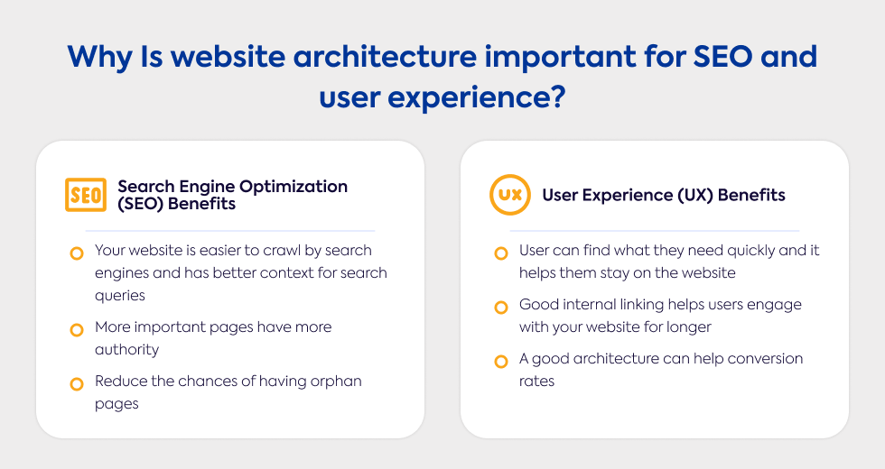
Search Engine Optimization (SEO) Benefits
A well-organized site helps search engines efficiently crawl and understand the hierarchy of your content. Internal links help distribute authority throughout your site, ensuring that no important page is left out. This also reduces the chance of orphan pages, which are difficult for search engines to find.
When your site's structure is clear, search engines gain better context, making it easier for them to match your pages to relevant queries. Additionally, the use of sitemaps (XML) guides crawlers directly to key pages. For larger sites, having a flat architecture boosts crawl efficiency and helps improve your site’s ranking potential. A well-planned URL structure also aids search engines in understanding the content hierarchy.
User Experience (UX) Benefits
For your visitors, having a solid website architecture means they can find what they need quickly. Simple navigation keeps people from bouncing off your site, while clear breadcrumbs help them understand where they are and how to get back to other sections.
A well-designed internal linking structure encourages deeper exploration by leading users to related content. This not only improves engagement but also helps reduce confusion. Consistent links and pathways keep users moving through your site with ease, which ultimately leads to a better overall experience.
Good architecture also supports your business goals, as it provides a seamless journey from the moment a user lands on your site to when they take an action, like making a purchase or filling out a form. This, in turn, boosts conversion rates. A smooth and intuitive structure is key to keeping users engaged and ensuring they have a positive experience navigating your site.
Key Elements of Good Website Architecture
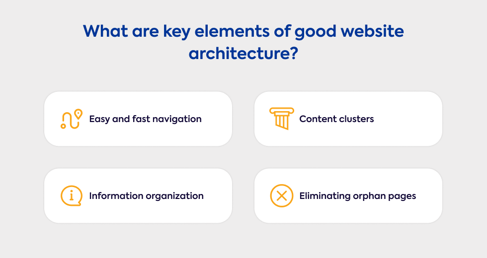
Having a well-thought-out site architecture is essential for creating a positive user experience and ensuring your website is easy for search engines to crawl. A strong structure makes it simple for both users and search engines to navigate through your pages. Whether you're dealing with a large or small site, organizing content effectively is key to success.
Flat vs Deep Website Architecture
In flat architecture, pages are accessible within 3-4 clicks from the homepage. This structure is preferred because it makes navigation easier for users and helps search engines efficiently crawl through your site. With fewer layers to work through, search engines can better distribute link authority across the site, improving your overall SEO performance.
A deep architecture, on the other hand, requires 5 or more clicks to reach specific pages. While this structure is often seen on larger websites, it can lead to a less ideal user experience and slower page indexing. Deep architectures can make it harder for search engines to crawl and rank your site, impacting its performance. So, if your goal is a site that is user-friendly and SEO-efficient, a flat architecture is usually the better option.
Information Architecture vs Website Architecture
While information architecture refers to how information is organized and labeled in a broader sense, website architecture is a specific subset that deals with the structure of your website. A good website structure includes elements like internal links, navigation, breadcrumbs, and sitemaps that make it easier for users to move through your site and for search engines to understand how everything is connected.
Information architecture impacts how users navigate your site and find what they’re looking for. A clear website hierarchy can contribute to SEO success, as a well-organized site helps search engines crawl and index your content efficiently.
Topically Relevant Content Clusters
One effective strategy for organizing your content is to group it into pillar pages and related cluster pages. Pillar pages cover broad topics, while cluster pages dive deeper into specific subtopics. This structure not only helps users find relevant information quickly, but it also makes it easier for search engines to understand how your content is related, which can improve your overall rankings.
Strong internal linking structure connects these clusters to the pillar page and to each other, creating a network that benefits both users and search engines. For example, a pillar page on “digital marketing” might link to cluster pages on topics like “SEO” and “content marketing.” This helps build topical authority and makes your content more relevant in the eyes of search engines.
Orphan Pages
Orphan pages are those that lack internal links, making them difficult for search engines to find and index. If these pages aren't connected to the rest of the entire website, it can hurt both your SEO and user experience. You want to avoid this scenario by regularly reviewing your site’s architecture and ensuring that every page is included in your internal linking system.
To prevent orphan pages, make sure they are part of the navigation or a category page, or at least linked to from other related content. Tools like Semrush’s Site Audit can help identify and fix orphan pages, ensuring that all pages contribute to the overall performance of your site.
Best Practices for Optimizing Website Architecture
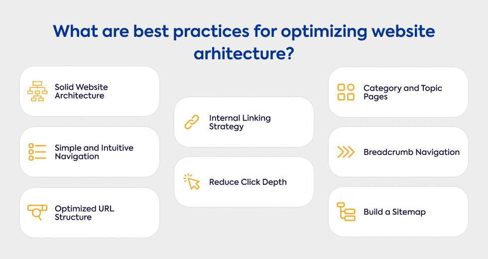
To create a good website architecture, it’s important to optimize both for search engines and users. A well-structured site makes it easier for search engine crawlers to navigate, while also providing a seamless experience for visitors. The following best practices will help you achieve this balance and improve your SEO.
Plan Your Website Architecture with Solid Goals
Before you start building your site, you need to define clear goals for user experience, traffic, conversions, and SEO. What do you want your site to achieve? Whether you're running an ecommerce site or a service-based website, your goals will shape how you design the structure.
Understanding user intent is key here. The architecture of your site should guide users toward key actions, such as purchasing a product or signing up for a service. Conducting research on user behavior, analyzing competitors, and defining performance indicators (KPIs) are crucial steps in this process. With a hierarchical structure, your site will not only support current content but also be scalable as your business grows.
Keep Navigation Simple and Intuitive
When setting up top-level navigation, stick to the most important categories. Limit your menu items to make it easier for visitors to find what they’re looking for. Each menu item should be directly tied to the content it leads to, making navigation clear and intuitive.
Avoid overloading your menus with too many options or using too many drop-down menus. Keeping the navigation depth within 3-4 clicks ensures users can access important pages quickly. Users and search engines both benefit from a clear, predictable path.
Optimize URL Structure
Your URLs play an important role in helping search engines and users understand your content. To keep them SEO-friendly, aim for short, descriptive URLs that clearly reflect the page's topic. Hyphens are great for separating words, as they are easy to read both by search engines and humans.
Keep your URLs simple and avoid unnecessary characters or parameters. Ensure your URL structure mirrors your site's hierarchy, such as domain.com/category/subcategory/page. Incorporating relevant keywords naturally into the URL is another smart move, as long as you avoid keyword stuffing.
Consistency across your URLs contributes to a clean, organized feel.
Internal Linking Strategy
An effective internal linking strategy helps direct users to the most important content on your site. Linking from high-authority pages to other key pages increases visibility and engagement. When creating these links, use relevant and descriptive anchor text to give users and search engines context.
Following the pillar-cluster model is a great approach. Link parent pages to sub-pages, and create connections between related pages to build topical relevance. This method also helps you avoid orphan pages, ensuring every page on your site is part of the broader internal link network.
Make sure internal links are included in the navigation, content, and sitemaps, as these are essential for both crawlability and user navigation.
Reduce Click Depth
Reducing the number of clicks required to reach important pages helps both users and search engines. A flat website architecture keeps things simple, with all key content accessible within 3-4 clicks from the homepage. This structure reduces the effort required for users to find content, enhancing their experience and keeping them engaged.
For search engines, less click depth means faster indexing of your pages, helping them perform better in search results. Avoid burying valuable content under unnecessary layers of subcategories that can make navigation more difficult.
Use Category and Topic Pages
Organizing your site with category pages and topic clusters helps users navigate and find content easily. Ecommerce sites often benefit from this structure, as it groups products into logical categories. Similarly, blogs and content-heavy sites should use topic pages (sometimes called pillar pages) that link to more detailed cluster pages.
This method strengthens your internal linking and helps build topical relevance. By improving the connections between your category and topic pages, you not only enhance user navigation but also signal to search engines that your site covers specific topics in depth, which can boost authority.
Implement Breadcrumb Navigation
Breadcrumbs are a simple but effective way to help users understand where they are within your site. They show the full navigation path, making it easy to backtrack to previous categories or parent pages. Breadcrumbs enhance user experience, particularly on larger sites, and are especially useful for e-commerce and content-heavy websites.
From an SEO perspective, breadcrumbs also help search engines understand the structure of your site. They should be placed above the page title and match the URL structure and overall navigation links on your site. Here’s an example: a breadcrumb trail might display "Home > Blog > SEO Tips," with each element clickable.
Build an XML and HTML Sitemap
Creating both an XML sitemap and an HTML sitemap is essential for improving your site's crawlability. An XML sitemap ensures that search engine crawlers can easily find and index all the pages on your site, especially new or updated content. Keeping this sitemap up-to-date is important, and many tools allow you to automatically generate and submit it to search engines like Google via Google Search Console.
Meanwhile, an HTML sitemap is more user-focused, providing a complete list of pages on your site to help visitors navigate. Both sitemaps serve different purposes, but together they contribute to making your site easy to explore for both users and search engines.
Incorporating these best practices into your site will create a strong foundation, improving SEO and user experience as your site grows.
Common Website Architecture Mistakes to Avoid
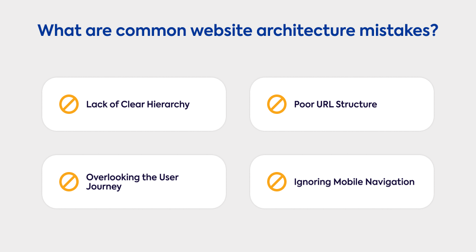
Building a solid website architecture is critical, but it’s easy to make mistakes that can negatively impact both usability and SEO. Understanding these common pitfalls can help you avoid them and create a well-functioning site.
Lack of Clear Hierarchy
A disorganized or deep website architecture can confuse both users and search engines. When pages are buried more than 4 clicks away from the homepage, it becomes difficult for search engines to crawl your site and distribute authority effectively. This issue often arises when there are no clear category pages or pillar pages to provide structure, leading to a chaotic navigation experience.
Without a clear path from top-level pages to subcategories and individual pages, users may feel lost, and search engines may struggle to index important content. Additionally, missing or inconsistent internal links between pages can break the flow, making navigation less intuitive.
Overlooking the User Journey
It’s easy to ignore the user journey when focusing on the technical aspects of a website. However, navigation should always align with user behavior and intent. When users can’t find what they’re looking for quickly, it increases bounce rates and decreases engagement.
A poor understanding of user pathways can lead to a site that fails to guide visitors toward key actions, such as purchasing a product or filling out a form. Without considering the flow from landing pages to key sections like product categories, services, or contact forms, the user experience suffers. Complex or unclear navigation can frustrate visitors and lead to higher abandonment rates.
Poor URL Structure
A poor URL structure can negatively affect your SEO and user experience. URLs that are overly long or contain unnecessary parameters make it harder for both users and search engines to understand what a page is about. Inconsistent URL formatting across the site can also lead to confusion.
When keywords are missing from URLs, they become less SEO-friendly, making it harder for search engines to properly categorize the page. Additionally, URLs that don’t reflect the website hierarchy (e.g., missing categories or subcategories) make it more difficult for search engines to understand how your content is organized.
Ignoring Mobile Navigation
With the rise of mobile browsing, mobile navigation must be a priority. Many sites struggle with poorly optimized navigation menus on mobile devices, which makes it difficult for users to find what they need. Failing to consider mobile-first indexing can negatively impact your SEO, as Google now prioritizes mobile-friendly sites.
Having a deep navigation structure on mobile devices, where users need to tap multiple times to reach important content, leads to frustration. Missing mobile-specific features like hamburger menus or dropdowns only add to the problem. If mobile navigation is slow or unresponsive, users are likely to abandon your site, which can hurt both engagement and SEO performance.
Website Architecture for the Future: Mobile and Voice Search Optimization
As technology evolves, website architecture needs to be optimized for both mobile and voice search. Ensuring your site is mobile-friendly and ready for voice search queries will improve both usability and SEO.
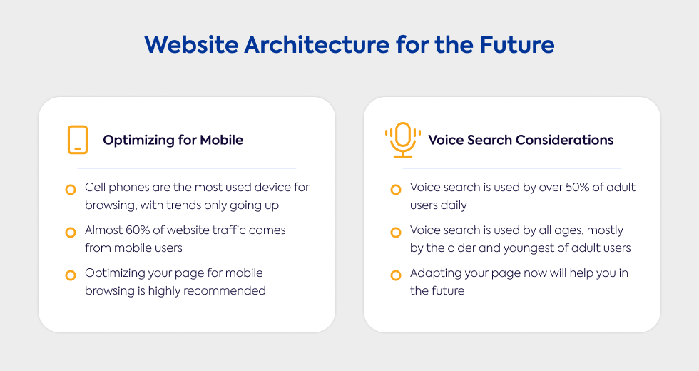
Optimizing for Mobile
With Google’s shift to mobile-first indexing, making sure your site performs well on mobile is more important than ever. Using simplified mobile navigation, such as hamburger menus, ensures users can easily find what they need, no matter the device. A flat site architecture is ideal for mobile, keeping pages within 3 clicks from the homepage.
Responsive design is essential to ensure your site adapts to different screen sizes. Focus on fast page load speed to meet the expectations of mobile users who want quick access to content. Additionally, mobile-optimized sitemaps (XML) help search engines crawl and index your site effectively.
To further enhance the user experience, avoid deep navigation that requires too many taps to reach key content. Ensure that buttons and links are easy to tap, and minimize the use of pop-ups, which can disrupt the mobile experience.
Voice Search Considerations
As voice search grows in popularity, optimizing your website for voice search is a smart move. Voice queries tend to be more conversational, so you should focus on natural language and long-tail keywords that align with how people speak. Using structured data (schema markup) helps search engines better understand the context of your content, which is crucial for voice search results.
Content that answers specific questions, such as an FAQ page, can help your site rank well for voice queries. Keep your content clear and concise to increase the chances of it being used in voice search answers. Additionally, a well-structured website makes it easier for both users and search engines to navigate.
Because many voice search users are looking for local information, make sure to optimize your local SEO. Including featured snippets can also boost your chances of appearing in voice search results, as these are frequently used for quick answers. Lastly, fast page load speed is critical since voice search prioritizes quick, accurate responses.
Let Gauss Help You Build a Future-Ready Website Structure
Struggling with your website's structure? At Gauss, we specialize in creating custom web development solutions that streamline your website architecture, ensuring optimal SEO, seamless navigation, and a better user experience.
Whether you need to implement a flat structure, optimize internal links, or prepare for the future of mobile and voice search, we’re here to help.
Let’s start a conversation
about how Gauss can transform
your website for success. Contact us today to discuss your project!
